MV = PT looks simple. Decompose T through the GDP expenditure identity and the entire monetary transmission mechanism falls out.
Origin: Discord banking thread → Copilot session (2025-11-19) → expanded here Links: Economics, Inflation, Business Cycles, Value and Profit, Yarvin x McCormack, Weinstein x Murphy, Evo-Cap: Optimal Money Supply, The GDP-Identity Tariff Fallacy — companion piece on the C+I+G+X−M identity’s hidden domain restrictions, Accounting Identities as Domain-Matching — the meta-pattern that ties this page and the GDP-identity page together as instances of one structural claim (macroeconomic identities are domain-matching tricks, not behavioral models)
Fisher’s equation of exchange:
MV = PT
The standard simplification replaces T with Y (real GDP), yielding MV = PY. This substitution assumes the ratio T/Y is roughly constant — that total transactions scale linearly with output. Textbooks use this because Y is measurable and T is not.
But T/Y is not constant. And its instability is where the interesting economics lives.
GDP measures the total value of final goods and services. T measures all transactions — intermediate goods, financial transactions, used goods, asset transfers, everything.
A loaf of bread:
Three transactions, one GDP event. The supply chain creates a multiplier. And bread is simple — a smartphone might pass through dozens of intermediate transactions before reaching the consumer.
Add financial transactions (stock trades, derivatives, forex, bond issuance) and the gap explodes. Global financial transaction volume is estimated at 70–100× global GDP. Most money movement in the economy is invisible to GDP.
Define k as the ratio of total transactions to real GDP:
T = k × Y (where Y = real GDP)
Then:
MV = P × k × Y = k × (nominal GDP)
And:
k = MV / (nominal GDP) = V_transaction / V_income
Where V_income = nominal GDP / M (the standard, measurable velocity) and V_transaction = PT / M (the true velocity). The transaction multiplier k is the bridge between what we can measure (income velocity) and what actually matters (transaction velocity).
k is not constant. Its instability tells you about the structure of the economy.
This is where the real find is. GDP decomposes into expenditure components:
GDP = C + I + G + NX
Each component has a different transaction multiplier — a different number of total transactions generated per dollar of final output. Call these k_C, k_I, k_G, and k_trade.
| **PT = k_C × C + k_I × I + k_G × G + k_trade × | Trade volume | + T_financial** |
Where T_financial is pure financial transactions (stock trades, derivatives, forex) that don’t correspond to any GDP component at all.
Consumer spending (k_C): moderate (~2–4×)
Each dollar of final consumer spending represents the end of a supply chain — raw materials → processing → manufacturing → distribution → retail. A grocery purchase might have 3–5 intermediate transactions. A service (haircut, legal advice) might have 1–2. A complex manufactured good (car, phone) might have 10–20.
k_C varies by:
Investment (k_I): high (~4–8×)
Business investment is the most transaction-intensive component of GDP. Building a factory involves: land purchase, architectural services, permits, construction materials (steel → iron ore → mining, concrete → cement → limestone, glass → silica → sand — each its own chain), equipment procurement, labor contracting, financing arrangements, insurance. Each of these is a cascade of intermediate transactions.
k_I is probably the highest multiplier of any GDP component. This matters for the business cycle — when I collapses during a bust, it takes a disproportionate share of T with it.
Government spending (k_G): variable (~1.5–5×)
Government spending is heterogeneous:
The weighted average k_G depends heavily on the composition of government spending. A government that mostly writes transfer checks has a low k_G. A government that mostly builds infrastructure has a high k_G. This means fiscal policy changes k even if it doesn’t change GDP.
Trade (k_trade): adds layers
Every cross-border transaction generates additional intermediary transactions beyond the domestic supply chain:
These are all T events but not GDP events (or only partially so). As trade volume grows, T_trade grows faster than the net export contribution to GDP. Globalization increased k partly through this mechanism — more intermediate goods crossing borders means more transactions per unit of final output.
Financial transactions (T_financial): the elephant
Stock trades, bond issuance and trading, derivatives (options, futures, swaps), forex speculation, high-frequency trading, crypto — none of this appears in GDP. All of it is in T.
T_financial has grown explosively:
This is where the velocity puzzle lives.
The puzzle: Income velocity (V_income = nominal GDP / M) has been falling since roughly 2000, and collapsed after 2008. If velocity is falling, the massive increase in M (QE, etc.) should have produced less inflation than expected. But the Austrians predicted hyperinflation. What happened?
The resolution through k:
V_transaction = V_income × k
Income velocity fell. But k was rising (financialization, expanding T_financial). The product — transaction velocity — may have been roughly stable or even increasing. Money wasn’t slowing down; it was being redirected from GDP-producing transactions to financial transactions.
QE money entered through the financial system (bank reserves → bond purchases → portfolio rebalancing). It stayed in the financial system. It inflated asset prices (Yarvin’s Z1) without touching consumer prices (CPI). Income velocity fell because the new money never reached the real economy; transaction velocity in financial markets surged.
This is the Cantillon effect (see Evo-Cap: Optimal Money Supply) expressed through the transaction multiplier: where new money enters the economy determines which component of T it inflates, which determines whether it shows up in GDP-facing prices or financial asset prices.
The expenditure decomposition reveals that the same GDP can produce vastly different T depending on its composition. This has several consequences:
New money doesn’t hit “the economy” generically. It enters through a specific channel:
This explains why QE and stimulus produce completely different inflationary profiles despite both increasing M. It’s not just the amount of money — it’s the entry point, which determines which k multiplier it activates.
If the economy shifts from manufacturing (high k_I) to services (lower k_C), overall k falls — fewer total transactions per dollar of GDP. If the economy financializes (T_financial grows), k rises — more total transactions per dollar of GDP, but the new transactions don’t produce anything.
This means k is a structural indicator:
When government spending shifts from procurement (high k_G) to transfers (low k_G), the overall transaction multiplier falls. This means a dollar of transfer spending generates fewer intermediate transactions than a dollar of procurement spending — fewer businesses involved, fewer supply chains activated, less economic “activity” per dollar.
This is related to but distinct from the Keynesian multiplier debate. The Keynesian multiplier asks “how much additional GDP does a dollar of government spending produce?” The transaction multiplier asks “how much total economic activity does a dollar of GDP represent?” They’re different questions with different answers.
During a bust, I (investment) falls sharply while C (consumption) falls less. But k_I > k_C, so the fall in T is larger than the fall in GDP would suggest. The economy “feels” worse than GDP indicates because the transaction-intensive sector contracted.
This also means V_income falls during recessions not just because people are hoarding money, but because the high-multiplier component of GDP (investment) collapsed, taking a disproportionate share of T with it. Velocity is partially a composition effect, not just a behavioral one.
If k can be estimated (using payment system data from the Fed — Fedwire, ACH, card transaction volumes — divided by real GDP), it might serve as a leading indicator:
The 2008 crisis would presumably show k spiking in 2005–2007 (massive financial transaction volume relative to GDP) and then collapsing in 2008–2009 (financial transactions froze while GDP fell less dramatically). This is testable.
Combining the equation of exchange with the expenditure decomposition:
| **MV = P × [k_C × C + k_I × I + k_G × G + k_trade × | Trade | + T_financial]** |
This single equation encodes:
The standard textbook MV = PY hides all of this by assuming k is constant. It’s not. And its variation is where the real economics happens.
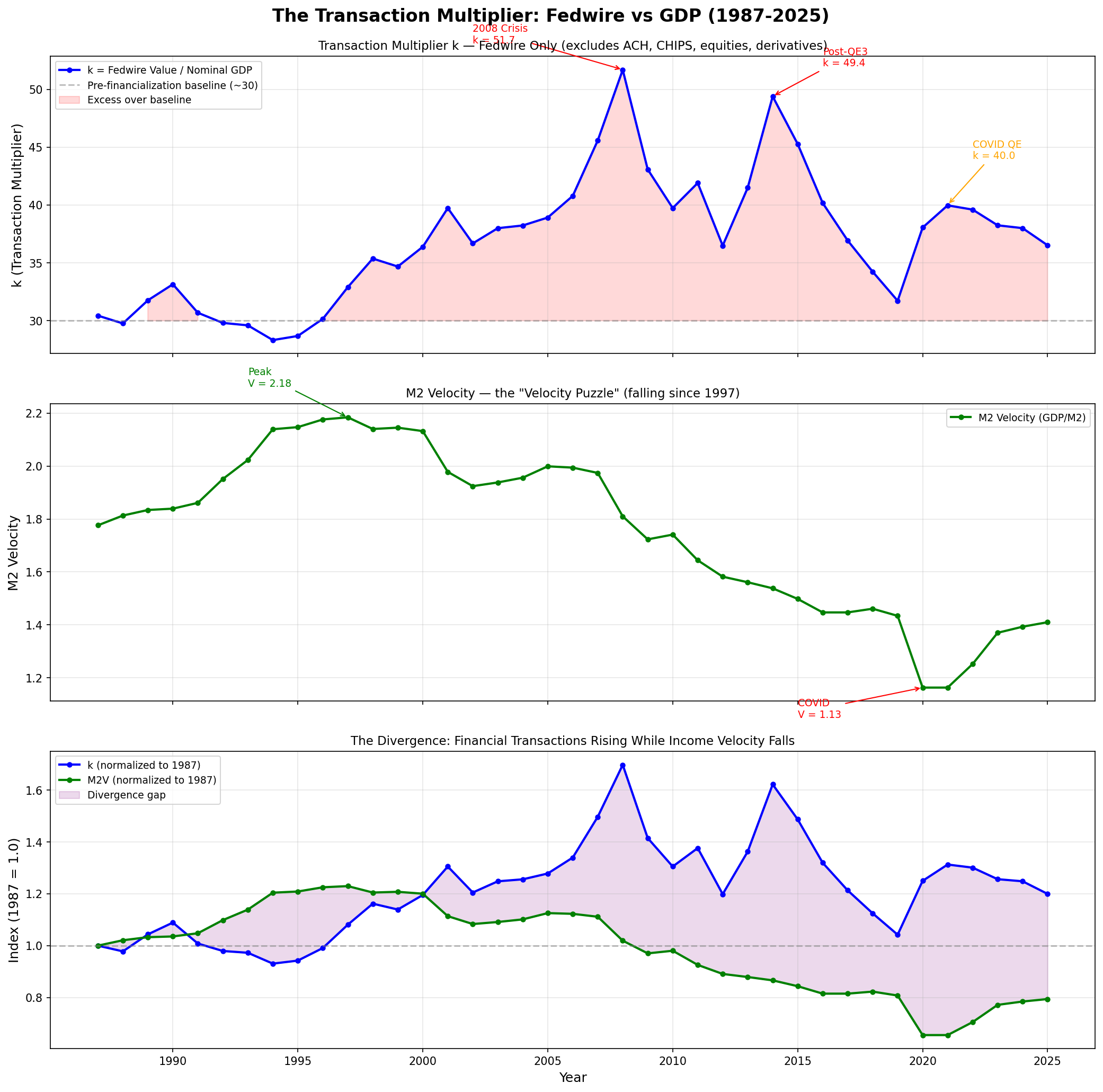
We can measure k empirically — at least partially — using Federal Reserve Fedwire Funds Service data (total value of interbank transfers) divided by nominal GDP. This captures only wholesale financial transactions (not ACH, card payments, equities, derivatives, or forex), so it’s a lower bound on the true k. Even so, the results are striking.
Data sources:
| Year | Nominal GDP ($T) | Fedwire ($T) | k (Fedwire) | M2 Velocity | k/M2V |
|---|---|---|---|---|---|
| 1987 | 5.0 | 152.5 | 30.4 | 1.776 | 17.1 |
| 1990 | 6.0 | 199.1 | 33.2 | 1.839 | 18.0 |
| 1994 | 7.5 | 211.2 | 28.3 | 2.139 | 13.2 |
| 1997 | 8.8 | 288.4 | 32.9 | 2.184 | 15.1 |
| 2000 | 10.4 | 379.8 | 36.4 | 2.132 | 17.1 |
| 2005 | 13.3 | 518.5 | 38.9 | 1.999 | 19.5 |
| 2007 | 14.7 | 670.7 | 45.6 | 1.974 | 23.1 |
| 2008 | 14.6 | 755.0 | 51.7 | 1.810 | 28.6 |
| 2009 | 14.7 | 631.1 | 43.1 | 1.723 | 25.0 |
| 2012 | 16.4 | 599.2 | 36.5 | 1.582 | 23.1 |
| 2014 | 17.9 | 884.6 | 49.4 | 1.538 | 32.1 |
| 2019 | 21.9 | 695.8 | 31.7 | 1.434 | 22.1 |
| 2020 | 22.1 | 840.5 | 38.1 | 1.163 | 32.7 |
| 2021 | 24.8 | 991.8 | 40.0 | 1.163 | 34.4 |
| 2025 | 31.4 | 1,148.3 | 36.5 | 1.410 | 25.9 |
1. k is not constant — and its variation maps to financial crises.
k ranged from 28.3 (1994, pre-financialization baseline) to 51.7 (2008, the financial crisis). In 2006–2008, k accelerated from 41 to 46 to 52 — financial transactions growing far faster than output. That acceleration was a quantitative signal that the financial economy had decoupled from the real economy. The system broke at peak k.
The 2014 spike (k = 49.4) coincides with QE3 winding down — the Fed’s balance sheet expansion was peaking and financial markets were saturated with liquidity.
2. The velocity puzzle is resolved — empirically.
From 1987 to 1997, k and M2V moved roughly together. After 1997, they diverge: M2V falls 35% (from 2.18 to 1.41) while k rises 20% (from 30.4 to 36.5). The bottom panel of the chart shows this divergence normalized to 1987 = 1.0.
The divergence means: money didn’t slow down. It was redirected. Income velocity fell because new money (QE, reserve expansion) entered through financial channels and stayed there. Transaction velocity in financial markets surged. The monetarist claim that “velocity absorbed the expansion” is backwards — velocity didn’t absorb anything. The money went somewhere GDP doesn’t measure.
3. The k/M2V ratio reveals the real harm.
The ratio k/M2V shows how many Fedwire transactions occur per unit of income velocity. It doubled from 13.2 (1994) to 34.4 (2021). This means the gap between financial activity and real economic activity has widened by 2.6× in three decades.
This is the financialization of the economy, measured. Every dollar of income velocity now has 2.6× more financial transaction overhead than it did in the mid-1990s. That overhead is not neutral — it represents real resources (human capital, computing infrastructure, regulatory compliance) allocated to moving money around rather than producing goods and services.
4. The monetarist defense collapses.
The standard monetarist response to “why didn’t QE cause inflation?” is: “Velocity fell, so MV stayed constant even though M rose.” This is true in the MV = PY form — but only because they’re measuring V against GDP. The data shows that money was moving, just not through the GDP-producing economy. The velocity “decline” is an artifact of measuring against the wrong denominator.
This matters because the monetarist defense — “no harm done, velocity adjusted” — masks the real harm:
5. And this is a lower bound.
Fedwire is only wholesale interbank transfers. Adding the other payment rails:
| Payment system | Estimated annual value | Data availability |
|---|---|---|
| Fedwire | ~$1,148T (2025) | 1987–2025 annual |
| CHIPS | ~$450T | Available from The Clearing House |
| ACH | ~$93T (2025) | 2000–2025, triennial before |
| US equity markets | ~$90T | SIFMA, exchange data |
| US Treasury trading | ~$225T | SIFMA |
| Card payments | ~$10T | Federal Reserve Payments Study |
| Derivatives (notional) | much larger | DTCC, BIS |
A conservative total T for the US in 2025 is roughly $2,000–2,500 trillion, giving a full k of 65–80×. The Fedwire-only k of 36.5 captures maybe half of total financial transactions.
The original page asked: “Can k be measured empirically?” Yes. Fedwire data provides a tractable partial measurement back to 1987. The time series clearly shows k varying with financial conditions, spiking before crises, and diverging from income velocity — confirming every theoretical prediction.
The original page asked: “Is T_financial / GDP a better bubble indicator?” Likely yes. k nearly doubled in the decade before the 2008 crisis (28→52). A k above ~45 appears to signal dangerous financial decoupling. The 2014 spike (49.4) didn’t produce a crisis because the financial system had been restructured (Dodd-Frank, higher capital requirements), but the signal was real.